
 Login
Login 

Guides
Workforce analytics — how to use your workforce data to improve field operations
By Humanz · 2026-06-22
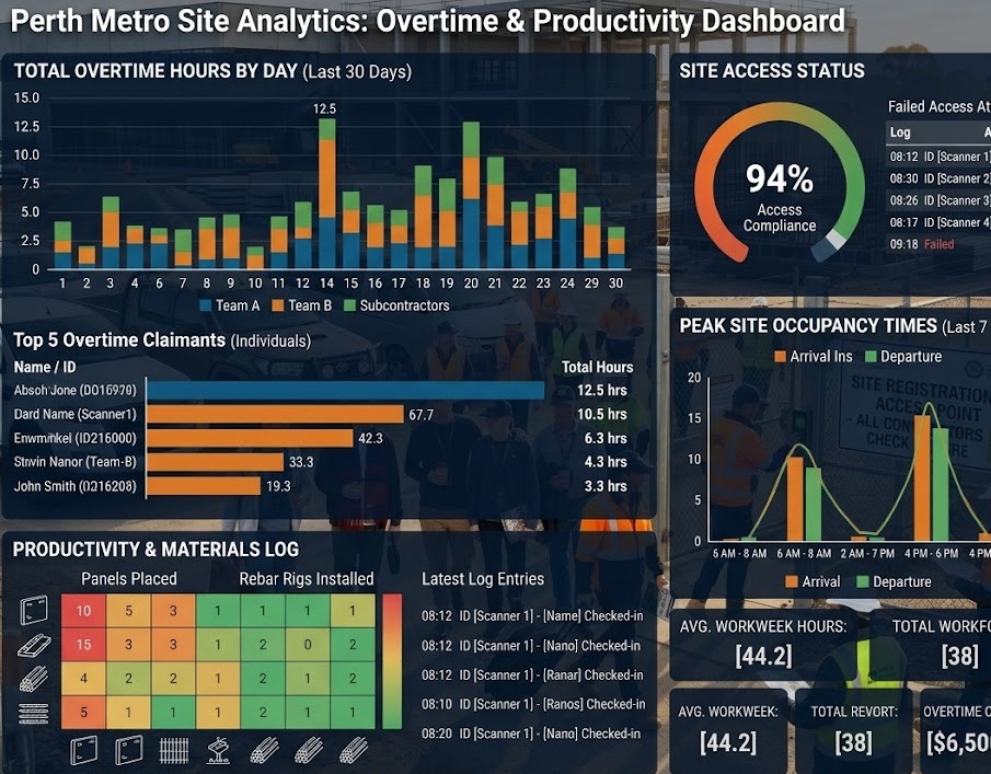
Every time a coordinator builds a roster, a worker submits a timesheet, a shift goes unfilled, or a fatigue alert fires, your workforce management platform records it. Over days and weeks, this accumulates into a picture of how your operation actually runs — not how you think it runs, but what the data shows.
For most field businesses, that data sits unused. Coordinators build next week’s roster without reference to last month’s no-show patterns. Project managers approve overtime without visibility of what’s driving it. Operations directors make staffing decisions based on gut feel rather than shift fill rates across sites.
Workforce analytics changes this. It turns your operational data into decisions — and for Australian trades, construction, and mining services businesses running complex, compliance-heavy operations, the difference between data-driven and instinct-driven workforce management is measurable in dollars and risk.
What workforce analytics actually means for field businesses
Workforce analytics isn’t a separate product or a reporting module you check once a quarter. In a well-built workforce management platform, it’s the continuous accumulation and surfacing of operational data that helps coordinators and managers make better decisions in real time.
For field businesses, the most valuable analytics fall into five categories:
Scheduling and roster performance — are shifts being filled? How long does it take from shift publication to full crew confirmation? Which sites consistently have coverage gaps? Which workers are most reliable for last-minute callouts?
Attendance and no-show patterns — which workers or roles have the highest no-show rate? Are no-shows concentrated on certain days, sites, or shift types? What does a no-show actually cost per incident, per site, per month?
Overtime and cost trends — how much overtime is being worked, by whom, and on which projects? Are overtime spikes predictable, or reactive to poor roster planning? What’s the cost differential between planned rosters and actual hours worked?
Compliance and fatigue data — how many fatigue alerts are being triggered per week? How many are being overridden by coordinators? Which workers are consistently approaching fatigue thresholds? Which sites generate the most compliance flags?
Asset and resource utilisation — which pieces of equipment are consistently under-allocated? Which are in demand across multiple sites simultaneously? Are service intervals being maintained or deferred?
Why field businesses are uniquely positioned to benefit
The Australian Bureau of Statistics Labour Force data consistently shows that construction and mining have among the highest rates of overtime work in the Australian economy. They also have the highest rates of workplace injury. These two facts are connected — and workforce data is the tool that lets operations managers see the connection in their own business before it becomes an incident.
Infrastructure Australia’s infrastructure market capacity reporting has identified labour productivity and workforce planning as among the most significant constraints on infrastructure delivery in Australia. Better use of workforce data at the business level is part of the solution — businesses that understand their own scheduling patterns, utilisation rates, and cost drivers are better placed to bid accurately, resource efficiently, and deliver on time.
The Civil Contractors Federation has noted that margin erosion in civil construction is frequently driven by labour cost overruns — specifically by the gap between planned and actual hours, and by unplanned overtime that wasn’t accounted for in project pricing. Workforce analytics closes this gap.
The key metrics worth tracking
Shift fill rate
Shift fill rate measures what percentage of published shifts are filled with confirmed workers before the shift starts. A business with a 95% fill rate is operating very differently to one with an 80% fill rate — the 15% gap represents shifts that are either scrambled at the last minute, remain understaffed, or aren’t filled at all.
Real-time rostering analytics can surface fill rate by site, project, shift type, or time period. A site that consistently has a lower fill rate than others isn’t bad luck — it’s a pattern with a cause. Data lets you find it.
Time from roster publication to full confirmation
Publishing a roster on Monday for a Wednesday start gives workers time to respond. Publishing it Tuesday night for a Wednesday morning start doesn’t. Tracking how quickly shifts go from published to confirmed tells you whether your lead time is sufficient and whether your communication workflow is working.
Shift confirmation tracking and messaging tools generate this data automatically — the gap between the timestamp on a shift publication and the timestamp on the last worker confirmation is a direct measure of planning efficiency.
No-show rate by worker, site, and role
Not all no-shows are equal. A worker who no-shows once in six months is an anomaly. A worker who no-shows one in five shifts is a reliability problem that should inform how they’re used for critical shifts. A site that consistently experiences higher no-show rates may have access issues, shift timing problems, or communication failures.
Tracking no-shows at this level of granularity — by individual, by site, by shift type, by day of week — turns a reactive problem into a predictable one. Reducing the cost of no-shows in construction covers the financial case; analytics is the tool that makes pattern identification possible.
Overtime hours and cost by project
Overtime is one of the most consistent sources of project cost overrun in field industries. The Fair Work Ombudsman’s overtime guidance sets out the rate obligations — but the operational question is why overtime is being worked, not just how much.
Analytics that breaks overtime down by project, site, or team reveals whether it’s concentrated in specific areas (suggesting a resourcing or planning problem) or broadly distributed (suggesting scheduling patterns need to change). Presenting this to project managers and estimators improves future project pricing.
Fatigue alert frequency and override rate
Fatigue alerts are compliance data. But the number of alerts triggered is also an operational signal — a site or shift pattern that consistently generates high fatigue alert volumes isn’t just a compliance concern, it’s an indicator that the rostering approach needs to change.
More revealing still is the override rate — what percentage of fatigue alerts are being overridden by coordinators rather than acted upon? A high override rate suggests either that the alert thresholds are misconfigured, or that coordinators are under pressure to push workers through alerts. Either way, it’s a risk that fatigue management software analytics makes visible before it becomes an incident.
Safe Work Australia’s data and research consistently links fatigue-related incidents to periods of high alert override — the pattern is well-documented at industry level. Analytics lets you see it at business level.
Timesheet accuracy: planned vs actual
The gap between rostered hours and actual hours recorded on timesheets is a measure of both rostering accuracy and timesheet integrity. Large, consistent gaps in one direction suggest either over-rostering (workers leaving early) or under-reporting (timesheets being submitted short). Large gaps in the other direction suggest consistent overtime that wasn’t planned.
Reducing timesheet errors in the field covers the accuracy case for digital timesheets. Analytics takes this further — tracking the planned-vs-actual gap over time turns it into a planning metric, not just a payroll accuracy issue. Businesses that track this consistently improve their project cost estimation with every cycle.
Compliance status by site and workforce
A compliance dashboard gives operations managers a real-time view of how many workers and contractors across their whole operation have current compliance documentation — licences, inductions, insurance certificates. Expressed as a percentage, this is a leading indicator: a site whose compliance rate is falling is heading toward a problem, not experiencing one.
This connects directly to the automated compliance system — when the compliance dashboard shows a declining rate, the underlying data shows exactly which documents need renewal and which workers are affected.
Turning data into decisions: practical applications
Better project pricing through historical cost data
Every project your business completes generates data: actual hours worked vs planned, overtime incurred, no-shows that required last-minute coverage, equipment utilisation rate. Over time, this data builds a picture of what projects in your sector actually cost to resource — not what you estimated.
AIPM’s project management frameworks emphasise that project cost estimation improves significantly when informed by historical actuals rather than assumptions. Your workforce management data is the source of those actuals.
Smarter resourcing decisions
A coordinator who knows that a particular worker has been close to their fatigue threshold three weeks in a row can proactively adjust their roster before the threshold is breached — rather than reacting to an alert on the morning of a shift. A business that knows which workers have the best confirmation rate for short-notice shifts can prioritise those workers for callout pools.
This is the difference between reactive rostering — filling gaps as they appear — and proactive workforce management, where data informs decisions before problems arise. The same data also feeds automated scheduling and auto-rostering, where confirmation rates, availability, and compliance status drive shift allocation with less manual effort.
Identifying training and development needs
If analytics shows that a particular role or skill set is consistently hard to fill — high fill lag, high no-show rate, high reliance on overtime — the underlying cause may be a shortage of qualified workers in that area. This data makes the case for targeted upskilling or recruitment before the problem becomes critical.
Training.gov.au maintains the national register of accredited qualifications — understanding which qualifications are hardest to find in your worker pool, from your own data, helps focus development investment where it delivers the most operational value.
Building the case for additional headcount
Every operations manager has made a case for additional headcount. Workforce data makes that case with evidence rather than assertion: here is the overtime we’re carrying because of under-resourcing, here is the cost per month, here is the safety risk expressed in fatigue alert frequency, here is the project delay risk from our current fill rate. CPA Australia and Business.gov.au both note that resource investment decisions backed by financial data are significantly more likely to be approved by boards and management.
What good workforce analytics looks like in practice
Not all workforce management platforms provide equally useful analytics. The differences worth looking for:
Data in real time, not batched reports — analytics that requires someone to run a weekly report are useful but limited. Real-time dashboards that reflect what’s happening now — live compliance status, shifts currently unfilled, workers approaching fatigue thresholds — allow coordinators to act before problems become incidents.
Drill-down capability — top-level metrics tell you something is wrong. Drill-down capability tells you where and why. A platform should allow you to move from “our overtime is up 15% this month” to “it’s concentrated on Site B during the afternoon shift, starting from the third week of May.”
Exportable data — for reporting to clients, boards, or project owners, data needs to be exportable in usable formats. Minerals Council of Australia and major construction clients increasingly require workforce compliance reporting from contractors — exportable analytics makes this simple rather than a manual exercise.
Historical comparisons — current performance is only meaningful in context. Analytics that allows comparison to the same period last month, last quarter, or last year reveals trends rather than snapshots.
Customisable by role — a coordinator needs different analytics to an operations director. The coordinator needs live shift fill rates and compliance flags. The director needs project cost trends and workforce utilisation across the whole business. A well-built platform serves both.
How Humanz workforce analytics works
Humanz is an Australian-built workforce management platform designed for trades, construction, and mining services operations. Analytics in Humanz aren’t a separate module — they’re built into the operational data that the platform generates from rostering, timesheets, compliance monitoring, and communication.
The Humanz analytics and reporting layer provides:
- Live shift fill rate — real-time view of confirmed vs unconfirmed shifts across all sites
- No-show tracking — historical no-show data by worker, site, shift type, and project
- Overtime and hours reporting — planned vs actual hours by project, site, or individual worker
- Fatigue alert dashboard — frequency of alerts triggered, override rates, and workers approaching thresholds
- Compliance status overview — percentage of workforce with current compliance documentation, by site and across the business
- Timesheet accuracy reports — planned vs actual hours gap tracking for payroll and project cost accuracy
- Asset utilisation data — allocation rates and service intervals for tracked equipment
- Exportable reports — workforce data exportable for client reporting, payroll reconciliation, and management reporting
For more on how the scheduling data that drives analytics is generated, see scheduler power tools — filters, teams, and tracking missed work with reason codes, which covers how the underlying operational data is captured.
For the workforce management context that this analytics layer sits within, see WFM software explained — what it is and why field teams need it.
See how Humanz works for your team →
Frequently asked questions
Do I need to set up analytics separately, or does it happen automatically? In Humanz, analytics are generated automatically from the operational data your team creates — rosters, timesheet submissions, compliance alerts, shift confirmations. There’s no separate setup required to start generating data. Dashboards are available from day one; they become more meaningful as data accumulates over weeks and months.
How much historical data is available? All operational data in Humanz is retained for the full period of your subscription and beyond, in line with Australian record-keeping requirements. Historical comparisons — month over month, year over year — are available as data accumulates.
Can analytics be shared with clients or project owners? Yes. Reports can be exported from Humanz in formats suitable for client reporting, principal contractor compliance submissions, and management presentations.
Does the analytics work for subcontractors as well as direct employees? Yes — all worker types tracked in Humanz contribute to the analytics layer. Shift fill rates, no-show data, and compliance status can be filtered by worker type, so you can see the picture for direct employees and subcontractors separately or combined.
What’s the minimum data needed to make analytics useful? Even a small team using Humanz for a few weeks generates useful patterns. Shift fill rates and timesheet accuracy reports are meaningful from the first week. No-show patterns and overtime trends become clearer over a month or more. The value compounds over time — the longer you use the platform, the richer the historical context.
Can I use workforce data to benchmark against industry norms? Your own data is the most relevant benchmark for your business — comparing this month to last month tells you more than comparing your business to an industry average. That said, Safe Work Australia’s data publications and Australian Bureau of Statistics workforce data provide industry-level context for metrics like injury rates, overtime prevalence, and workforce mobility.
How does workforce analytics connect to financial reporting? Humanz generates the labour cost data — actual hours by worker, overtime volumes, project allocations — that feeds into financial reporting and project cost reconciliation. For businesses using accounting platforms, this data can be exported to feed directly into job costing or project management financial tracking.
Want to see what your operational data looks like in a live dashboard? Book a demo and we’ll show you how Humanz analytics works for your industry and team size.
Related articles
Ready to see Humanz on your own roster?
Free 30-minute walkthrough — we'll use your real crews, sites and shift patterns.